Project Brief
Pure Water, a UAE-based water provider, serves both residential and business customers. I was tasked with designing a seamless, user-friendly water bottle ordering app for distributors and retail customers, ensuring a smooth and convenient shopping experience.
Role
Freelance UX/UI designer
Product Vision & Goals
We are building a user-friendly water bottle ordering app for Pure’s loyal and potential customers, catering to both retail and business users. The app will feature a clean, professional visual design, ensuring a seamless onboarding experience with straightforward navigation.
Key objectives include:
- Effortless ordering with a well-organized directory of bottle sizes.
- Convenient, intuitive usability, making tasks easy to complete.
- Future scalability, allowing room for additional features.
- A refined, trustworthy brand identity that enhances Pure’s professional appeal.
The Design Process

Research
Ideally, I would have conducted comprehensive research - including online surveys, personas, and contextual inquiry - but due to time, budget, and project scale, some assumptions were necessary. Feedback would later inform future iterations and feature enhancements.
To understand user expectations for interaction and navigation, I conducted stakeholder interviews and created journey and user flows - a crucial step in ensuring the app’s usability and value.


To design an intuitive user experience, I began by creating a simple journey map to identify pain points and moments of delight. This helped refine key decisions, such as the placement of the registration screen, which significantly impacts user engagement.
Through competitive analysis, I found most apps forced early registration, a major friction point that often leads to user drop-off. Instead, I prioritized delayed registration, ensuring users were sufficiently engaged before requesting personal information. Given that mobile apps are used intermittently, the onboarding process needed to be seamless and low-friction to encourage adoption.
By analyzing top competitors from the App Store, I gained market insights, identified common UX standards, and uncovered gaps in usability. Many competing apps lacked intuitive design and user-centric solutions, reinforcing the need for a streamlined, user-friendly approach in Pure’s app.
Metric for the competitive analysis:
- User goals and product goals
- Usability
- UI/UX
- Look and feel Specific User flow/screens
- Registration
- Purchasing process
- Shipping and delivery process
- Onboarding process
Using insights from the research phase, I developed user flows and collaborated with stakeholders for review and refinement. With their feedback, I proceeded to the first iterations of wireframes, laying the foundation for a seamless user experience.


Solution
I began with wireframing to establish the application's layout and overall structure, ensuring a clear interaction flow without distractions from visuals or colors.
Next, I created low - fidelity prototypes to validate concepts with users and stakeholders. This allowed for rapid iteration, refining design ideas efficiently based on feedback. After multiple revisions, I finalized the wireframes and transitioned to UI design.
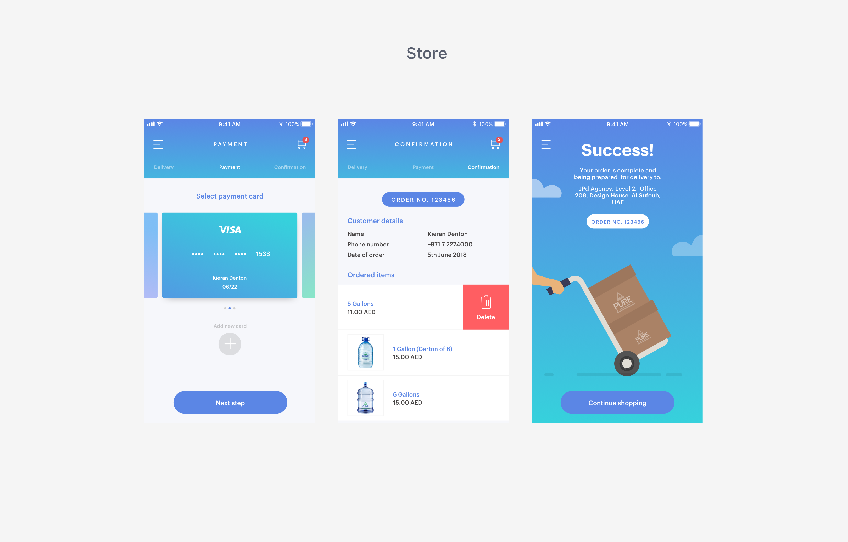
For the checkout process, I implemented a linear user flow, guiding users through a clear beginning, middle, and end—making task completion predictable and efficient. Following Hick's Law, I minimized steps for simplicity, using large, easily recognizable buttons for delivery, shipping, and payment options to enhance clarity and accessibility.
Lessons learned
While the app is still in progress, initial feedback from the company has been positive. Further testing is needed to refine and validate the solution.
Key takeaways from this project:
- Research is invaluable - Even limited user research provided critical insights, shaping both UX and visual design. It serves as the foundation for informed decision-making and validation.
- Early focus on journey maps and user flows - Mapping out user interactions upfront streamlined the design process, ensuring intuitive and elegant experiences before diving into screen design.
- Validate early and often - Gathering feedback at every stage, even with rough ideas, helped refine concepts quickly and avoid unnecessary revisions.


